Ok if you read my blog frequently you will know that I am quite obsessed with Wang..(see ad campaign timeline lol)
At a young age he has truly made a stance in fashion, all by following he's own ideals of fashion...plus he has great personal style- very true to himself!
To say I love this man is an understatement!! [ sigh ]
Looking through Alexander Wang's past ad campaigns it is safe to say he never fails to amaze with the visually appeasing quality prints. He seems to know how to use very simplistic concepts into breathtaking imagery that adds more depth into the collection he is trying to sell.
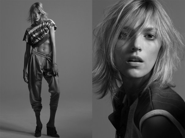
We have now reached 2011 and he has released the first image of his Spring/ Summer ad campaign. Bursting with energy, like his catwalk show, the image represents the collection to the T!
The model for the shoot is Aymeline Valade and the photographer is Craig McDean, with once again Fabien Baron acting as Creative Director. Their are four exclusive images that would be released in the March issue of Interview Magazine. That alone is an incentive to cop that issue from a news stands near you.
What ins't there to love about this ad campaign. I love sombre mood of the shoots, alongside the full and facial shots of each model.
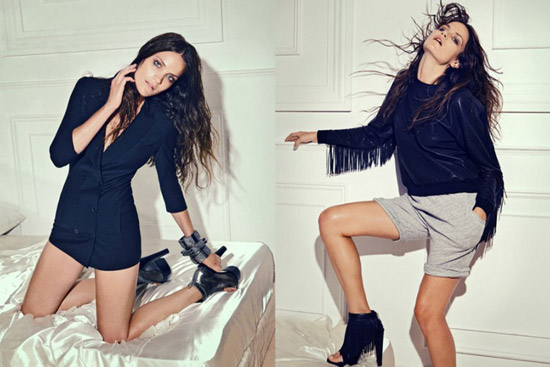
MODEL: Jacquelyn Jablonski
MODEL: Liu Wen
2010 SPRING/ SUMMER T COLLECTION
I had to add this ad for Wang's T fusion line collection. Simple but affective!
2010 FALL/WINTER COLLECTION
Abbey Lee Kershaw modelled in the 2010 Fall collection of Alexander Wang. Photographed by Craig McDean. Fabien Baron acted as art director whilst Karl Templer was the stylist.
I find that black and white concept of the shoot adds to the artistic edge of the multiple imagery of the model, hence adding an extra quality to the ad campaign.
The January 2011 Vogue Germany spread brought a sporty theme with the styling in luxe athletic fashions.
Model Maryna Linchuk wears wintry pieces from the Sping collection of Jil Sander, Michael Kors and Prada. She is also styled in sports bras, cut-out body suits and ski goggles.
The sexy tomboy look is a mixture of active wear such as Nike cropped tees and haute couture pieces.
As I have a keen interest in photography I find the concept photography amazing, particularly the photoshop affects edited on top. It gives me something to think about when I begin the process of photographing my collection.
Edun is also a label I have been watching for some time now.
The lifestyle fashion brand is one I have followed as it is an eco label that works with African countries that produce cotton. Launched in 2005 with Ali Hewson and Bono, their mission is to make clothes using ethical conditions and processes in developing world. 90% of Edun's cotton clothing is made by labour in Peru and Tanzania. Almost half of the raw cotton comes from poverty hit areas of South America and Africa.
I had an insightful few weeks of just looking into designers that have influenced me along the way and that will probably continue to inspire my design development and see how they continue to create new collections but still remain true to themselves and to their design aesthetic.
I have always been a womenswear designer, i love the shapes and form clothes give to woman and visa versa, but now more than ever I have been really into menswear. Menswear has changed alot, as designers are more open to experiment with feminine features that still embodies masculinity in design. I have come to the realisation that I may have a calling for menswear design in the future. I have been doing my own separate sketchbook, outside my graduate collection, just looking into the idea of combining feminine aesthetics into masculine structures and materials.
For now I want to share with you the menswear labels that I have had great inspiration from.
I am in love with this collection. Like my collection their is a real feel of Sports Luxe in this collection with clever use of material and cut. It has that relaxed feel to it, with the mix of sweater material and jersey, but also classic in cut.
Back from my holiday and ready to start the next step in 2011.
2010 was good but 2011 would be a great year for me. I am focused on what I wish to succeed in. While on my break I have been keeping up with some designers I had begun to watch since last year.
Gaspard Yurkievich is one of them. The french designer is one of those designers that any fashion forward male or female look to for style inspiration. His collections are young and fresh with great energy to them. Since his solo A/W 1999 'Distressed' collection in 1998, Yurkievich has shocked the fashion world with his fashion shows, that usually have sexual themes.
I'll leave for now with some images from his S/S 2011 menswear collection.
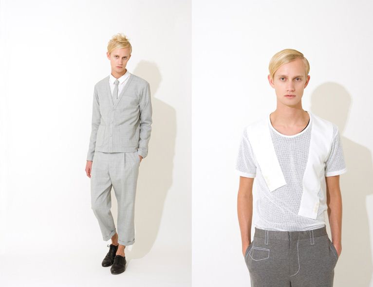
Alexander Wang‘s T collection is his basics line. The Spring/Summer 2011 season looks are packed with pieces that include in-trend colours like camel and beige, and the innovative designer's signature minimalist style matched with ruched minis, slouchy pants and baggy hoodies (heaven).
T by Alexander wang Spring/Summer 2011 will be available end of January/February online @ alexanderwang.com, net-a-porter and shopbob.com, Browns, Saks and many more online retailers so get ready to SHOP!
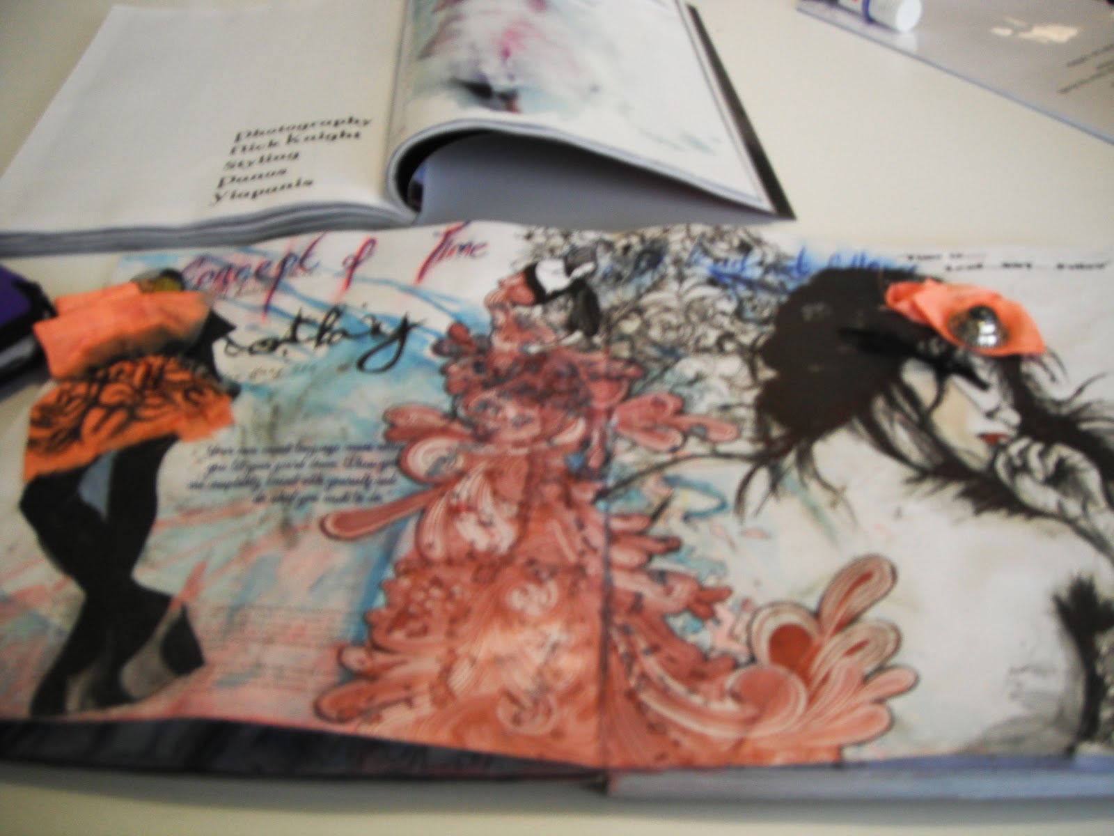
Here are some images from my initial sketchbook for my final year collection.
The process of the collection started out with me looking into ART and GRAPHICS and wanted to explore how colour can determine a design process- the design aesthetic/concept/theory/overall look.
I started to work over a graphic book I had been inspired by the pages of the book to determine a look and feel.
[This picture is of a page from the book- The graphic of the page was skulls so I depicted my view on the 'death of tailoring' looking into the tailored pieces by Gilbert Adrian]
This was a great way to get into the design frame of mind...but inevitably it would not act as my main source of inspiration, more so a way of thinking about design.
As posted previously the collection now based on Francis Bacon and the shapes, contours, lines, geometry, colour breakdown of his paintings and applying the design theory I have gained from the sketchbook above to start a new process of thinking and developing a collection.
I would be going into more detail about this in the coming days and weeks leading to my final developed COLLECTION.
VERSACE's 'VERSUS' diffusion line was created in 1989 and had a defined focus on innovation and flair. It re-launched in 2009 and with that came a new collaboration with British Designer Christopher Kane as the lines Designer, and Donatella Versace as the Creative Director. The youthful glamour fused with rock-chick look is the lines aesthetic.
The A/W 2010/2011 collection is filled with waist fitted and flared knife pleated prom skirts, sultry dresses cut from light weight silk and satin, paired with structured leather jackets and printed t-shirts to give it the chic rock look.
This collection is Christopher Kane's second collection for Versus. The collection is based on the 1990s rock ‘n’ roll culture for the edgier woman in us.
Collaboration was also brought in from photographer Bruce Webber’s tinted photos for the Versus brand tees.In 1991, Peter Lindbergh shot an iconic cover for American Vogue. The feature involved all the supermodels of the time from Cindy, Naomi and Cristy amongst others. They were styled with black leather biker jackets and little pleated skirts from the Versace range.
This Versus A/W 2010-2011 collection also features the 1991 Peter Lindbergh photos of models Linda Evangelista and Naomi Campbell that were silk-screened on to t-shirts and bags using a stone-washed effect that were matched with mini puffy satin-pleated dresses.
The Iconic Photo below...
[Cindy Crawford, Tatjana Patitz, Helena Christensen, Linda Evangelista, Claudia Schiffer, Naomi Campbell, Karen Mulder, Stephanie Seymour in Gianni Versace:Autumn/Winter 1991-1992, Vogue, September 1991, Photograph by Peter Lindbergh, Photograph courtesy of Peter Lindbergh]